Get Microsoft Planner dashboards and reports, without Power BI
Planner gives each plan a status, bucket, and assignee chart, and stops there. Reporting across plans means standing up Power BI through the Microsoft Graph API or Power Automate, which becomes an IT project of its own. Placker reports across your Planner data without that plumbing.
Quick facts
Reports for Microsoft Planner
Cross-plan dashboards straight from Microsoft Planner. Here is what they deliver:
- No Power BI required. Placker reads your Microsoft Planner data directly, with no Power BI, Graph API, or Power Automate flow to set up.
- Across plans, not just one. Combine tasks from multiple plans into a single portfolio view that Planner's own single-plan charts can't produce.
- Built from live data. Assemble KPI tiles, bar and line charts, pivot tables, card tables, doughnut and pie charts, and capacity views straight from current task data.
- Same numbers every week. Export any dashboard to PDF or schedule a recurring email so stakeholders receive the same numbers on a cadence.
Cross-plan reporting
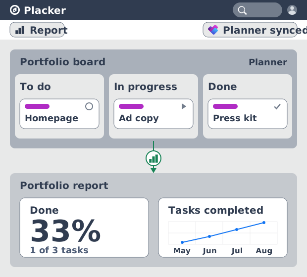
Microsoft Planner dashboards and reports across every plan
Your Planner tasks render as dashboards, so cross-plan reporting no longer waits on a Power BI model wired through the Graph API or Power Automate. An IT-managed team gets portfolio reporting without a data engineer building a pipeline first. The setup that native Planner reporting pushes onto Power BI happens inside Placker instead.
Widget charts
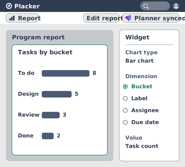
Turn task fields into the metrics leadership asks for
Those dashboards are built from widgets that read Planner fields such as buckets, assignments, due dates, and progress, then chart them. A program manager shows completion and overdue work by bucket without exporting tasks to Excel. The numbers come from the plans your team already maintains in Microsoft 365.
Program dashboard
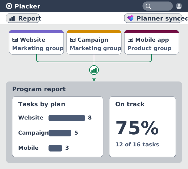
One dashboard for a Microsoft 365 program
Those plans can live in different Microsoft 365 groups, and you can pull them into a single view. A PMO running a program across several departments sees each plan's health side by side, rather than opening Planner once per group. The roll-up that Planner leaves to Power BI sits in one Placker dashboard.
How It Works
Four steps from your Planner plans to a shared dashboard.
- 1
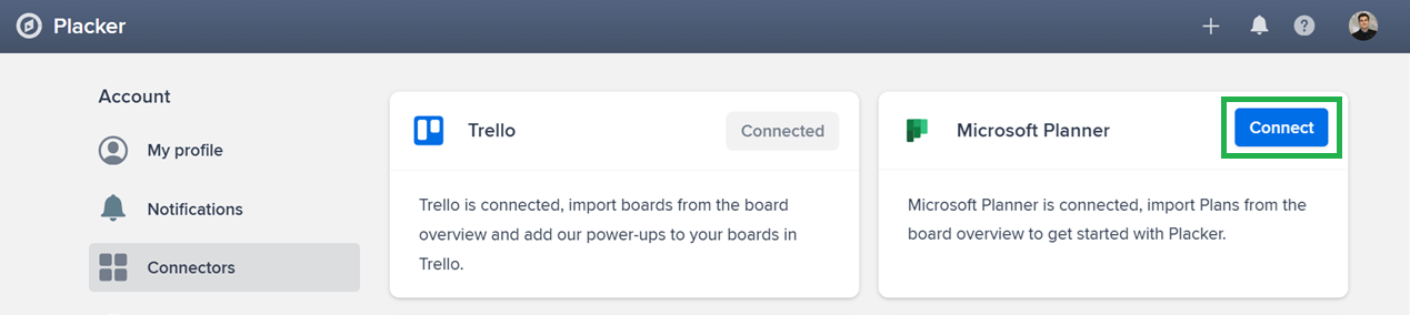
Connect Microsoft Planner
Open your profile in the top right, go to Connectors, and link your Microsoft 365 account. An administrator authorizes Placker for your tenant the first time, then everyone on the tenant can connect.
- 2
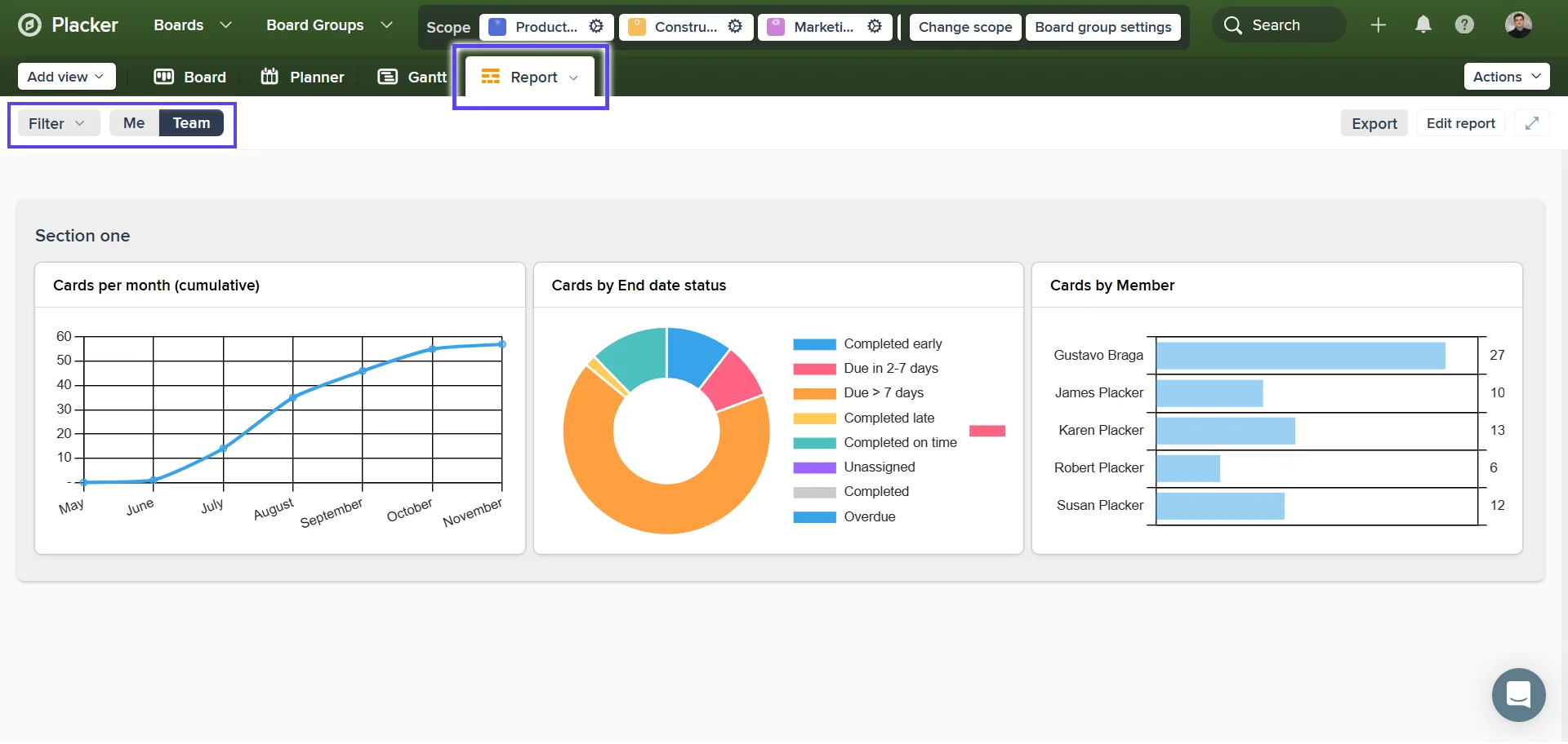
Open the Report view
Open Report on a plan or a group of plans and start from the showcase layout.
- 3
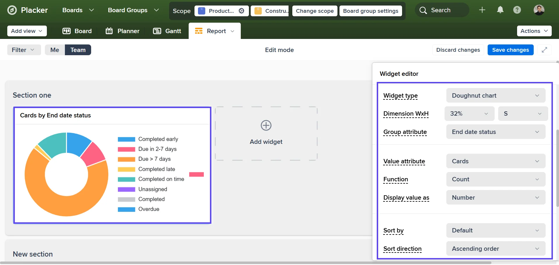
Build the dashboard
Add widgets, point each at a Planner field such as bucket, assignment, due date, or progress, then filter to focus the view.
- 4
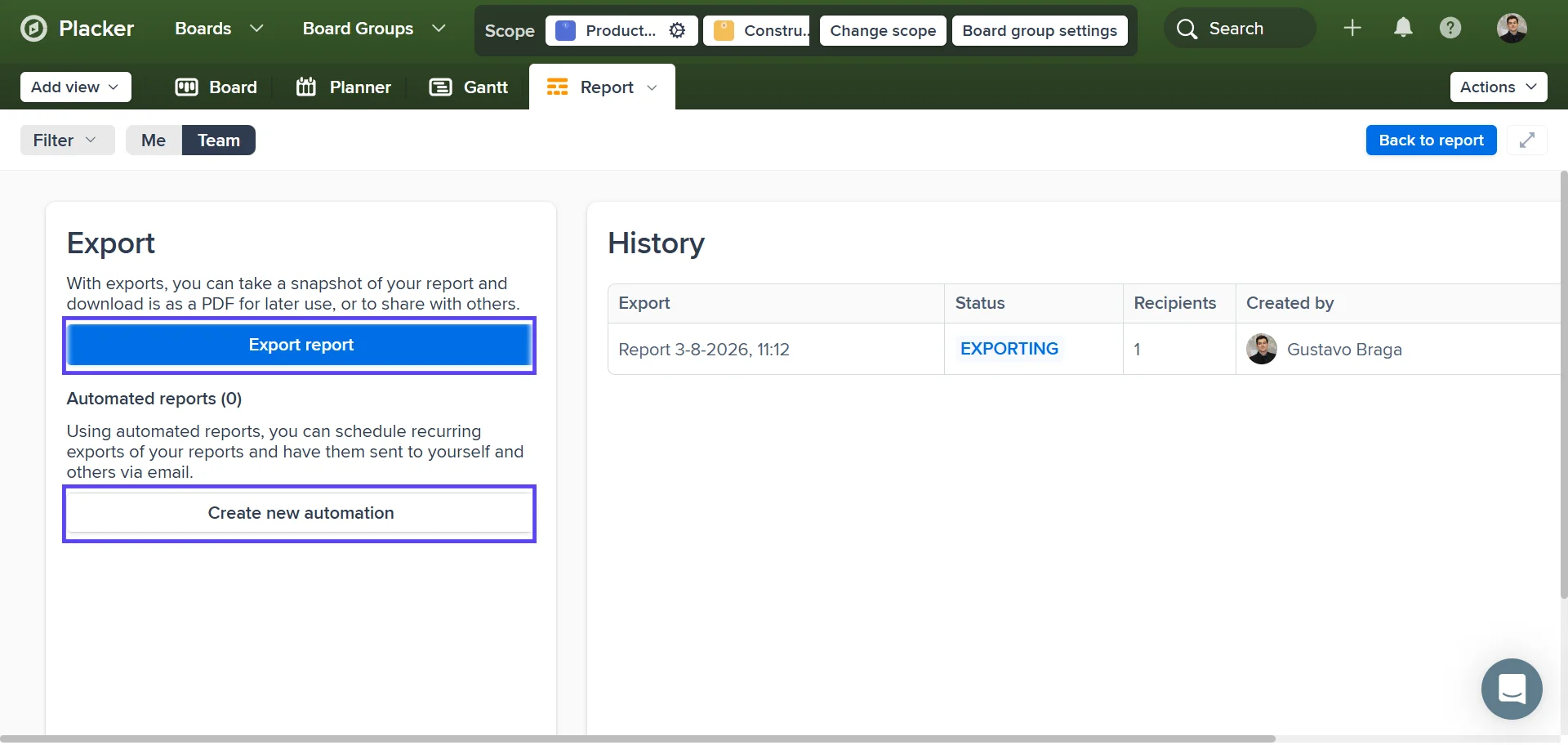
Share or schedule
Export to PDF, or schedule a recurring email so stakeholders receive the report on a cadence.
Use cases
See how teams use Placker's reports to track progress across their Planner plans and make better decisions.
Enterprise PMO on Microsoft 365
Reviews a portfolio that spans plans across several departments, without commissioning a Power BI report for each one.
IT service team
Tracks backlog and throughput across request plans on a line chart, and spots the queue growing before it becomes a breach.
Operations team working in Teams
Brings plans tied to different Teams channels into one status dashboard, so the weekly review has a single source.
Program manager
Shows completion by bucket for a release and flags overdue tasks before the next stakeholder check-in.
Tips & Best Practices
Practical advice to get the most out of your workflow
Trace an at-risk report back to the schedule
When a report flags overdue or stalled Microsoft Planner tasks, open the same plan on the Gantt chart to see which downstream work that slip pushes and whether the end date is still safe.
Filter reports by Microsoft Planner bucket or label to focus your analysis
Narrow your report to a specific bucket or label to get a clear view of how a particular phase, project, or workstream is progressing. Focused reports are easier to act on than everything-at-once views.
Export your Microsoft Planner reports to PDF or CSV
Create a shareable snapshot of your team's progress and export it as PDF or CSV. Perfect for status updates or leadership reviews with people who need visibility but don't have Placker access.
Compare reports over time to improve planning accuracy
Running the same report at the end of each sprint or month lets you see how your team's pace and output are trending. Use those patterns to set more realistic targets and improve future estimates.
Related pages
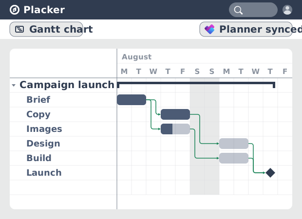
Gantt chart for Microsoft Planner
Microsoft Planner has no true Gantt chart. Placker turns Planner tasks into a timeline with dependencies and a critical path. Start free.
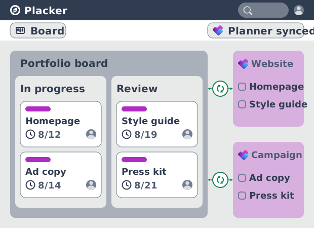
Microsoft Planner board view: layouts and reports
Add custom grouping, swimlanes, and Kanban reports to your Microsoft Planner board view. Placker reads your plans, no rebuild. Start a free trial.
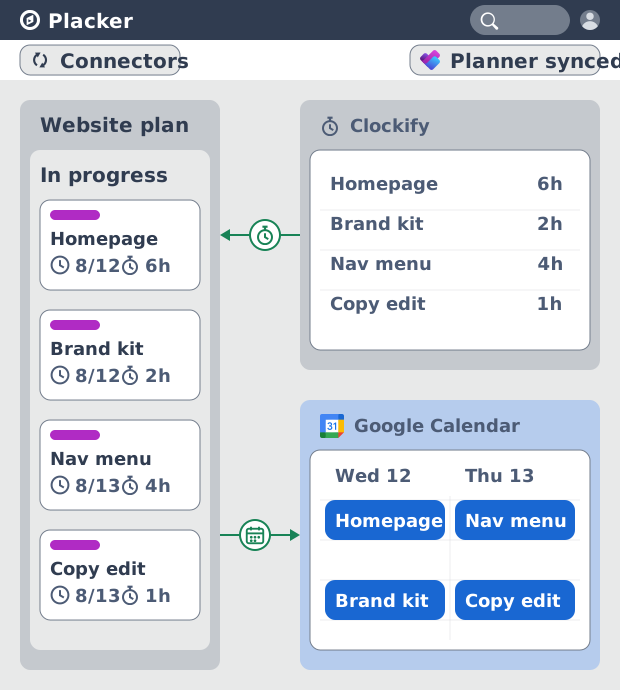
Microsoft Planner integrations: two-way sync
Sync Microsoft Planner plans two ways with Placker and add the calendar, time tracking, and automation Planner lacks. See how it works.
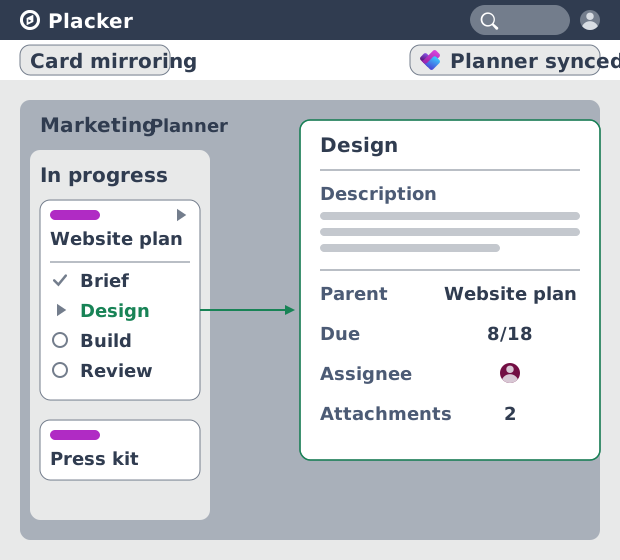
Subtasks in Microsoft Planner: Parent-Child Tasks
Add real subtasks to Microsoft Planner without premium. Parent-child tasks give each subtask an assignee and dates, and roll effort up.
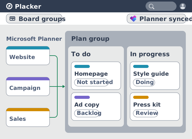
Microsoft Planner: see many plans in one view
See tasks from several Microsoft Planner plans in one board view, no Project Plan 3 or 5 license needed. Placker works on every tier. See how it works.
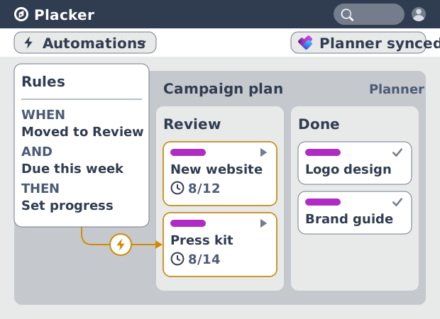
Microsoft Planner automation, no Power Automate
Add conditional automation to Microsoft Planner without Power Automate. Placker runs visual rules on your plans and tasks, plus recurring cards. See how.
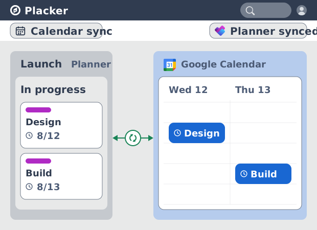
Microsoft Planner Google Calendar sync (2-way)
Microsoft Planner has no native Google Calendar sync. Placker syncs your tasks to Google Calendar, both ways, in minutes. Start free trial.
Ready to get started?
Easy to setup, no credit card required, start your trial today!